- 356 following
- 25766 followers
- Follow
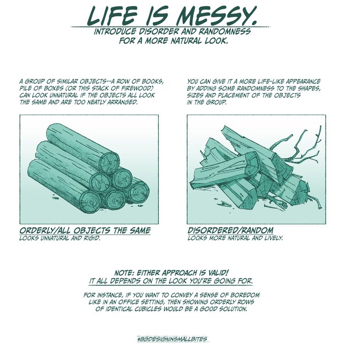
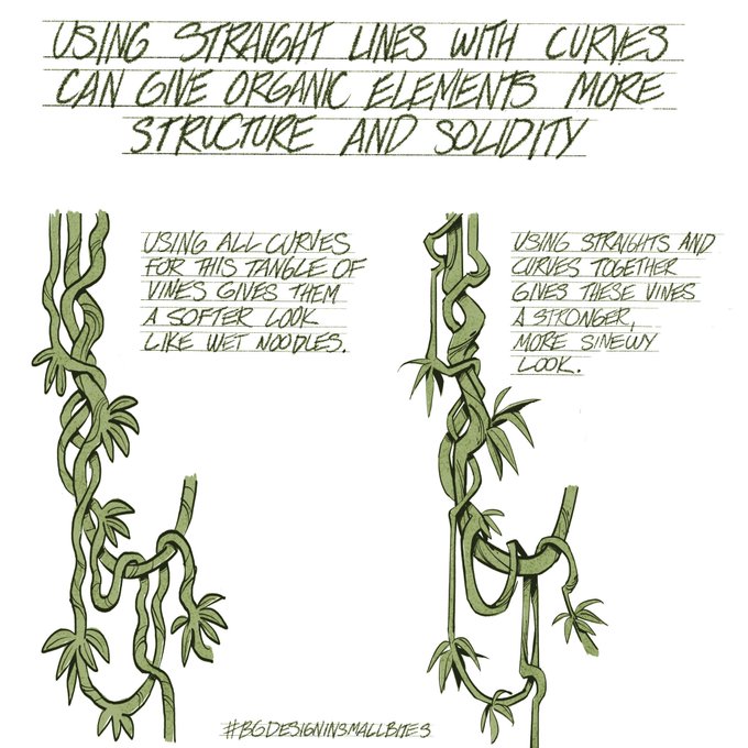
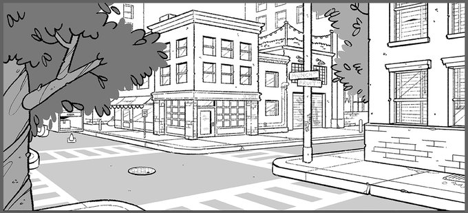
Haven’t done one of these in awhile-this newest #BGdesigninsmallbites is about how adding a bit of ramdomness can give your drawings a more natural, less rigid feel—
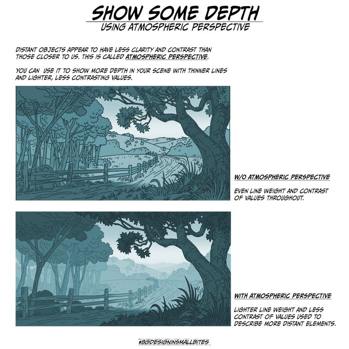
This latest #BGdesigninsmallbites is about how to help your drawings convey the illusion of depth using line weight and contrast of values.
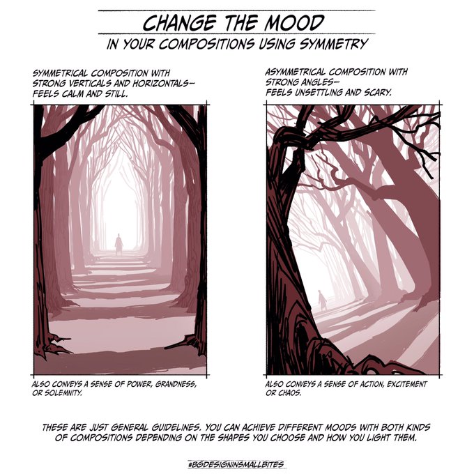
This latest #BGDesigninsmallbites is about how symmetry (or asymmetry) in your composition will convey different moods.
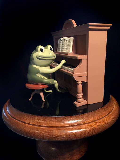
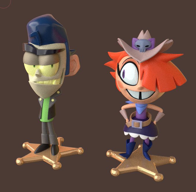
I got an email from someone who bought a #JasonFunderburker figure from #OTGW on eBay and he had some questions about it because it looked different from the ones I sold a few years ago. Little did he realize what he had stumbled upon—
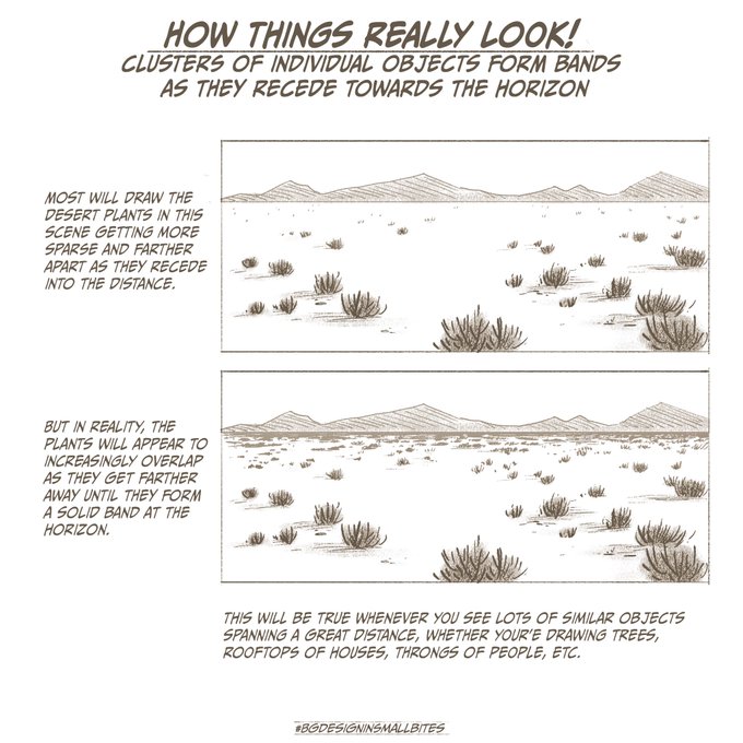
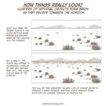
Things often look different in life than how we imagine them. This #BGDesigninsmallbites is about something I noticed while researching the look of desert highways for #kidcosmic
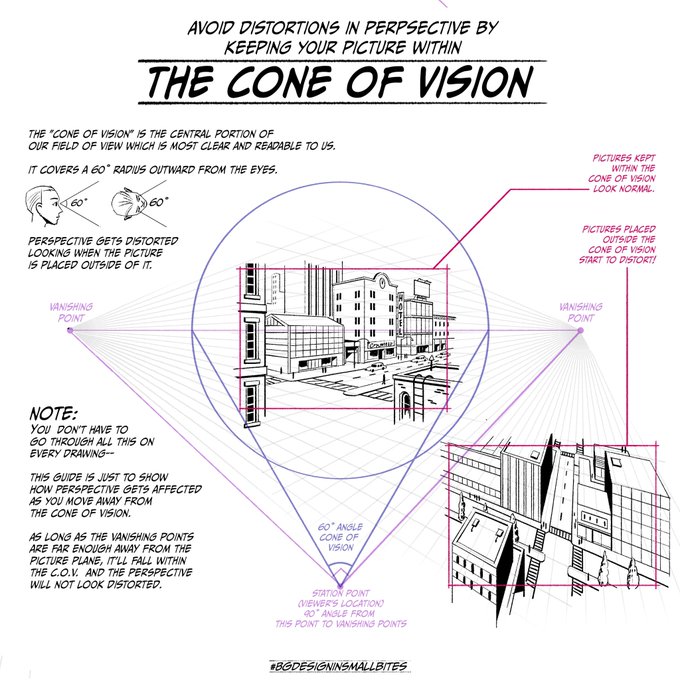
Is the perspective in your drawing looking a bit off? Could be your picture is outside the “cone of vision”. This #bgdesigninsmallbites explains how it works. Squeezed a lot of info into this one so if you have questions, LMK!
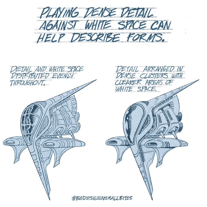
Opposites (in this case, detail and white space) can work together to define form. #BGdesigninsmallbites
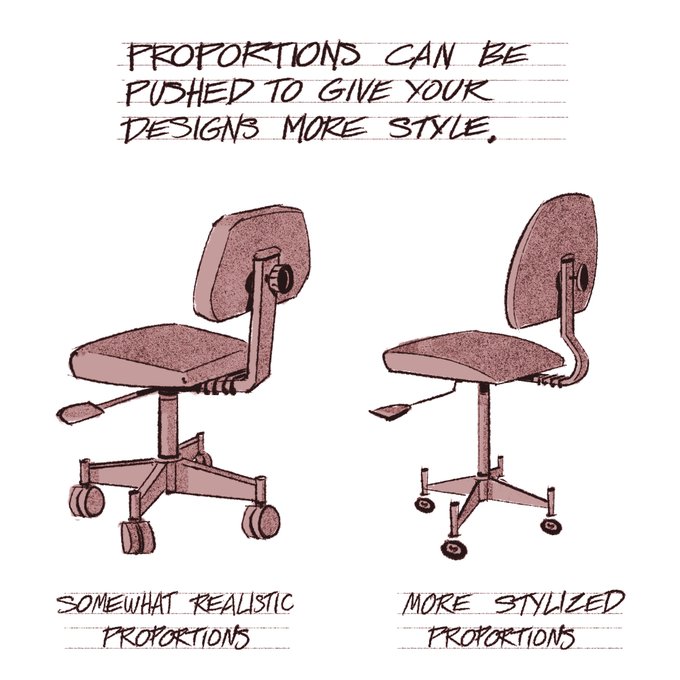
Give this a try—Push your design’s proportions just a little to give it a more interesting silhouette as well as a more elegant and stylish look. #BGdesigninsmallbites
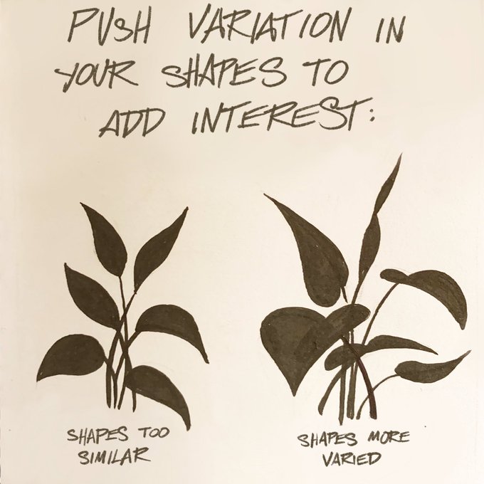
Trying a simpler format for these #BGdesigninsmallbites tweets. This one is about how adding variety to your drawings will improve them:
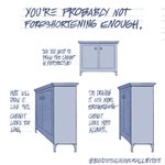
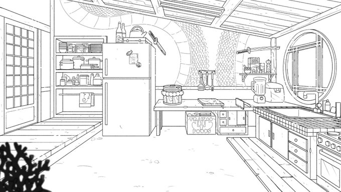
🎨 #BGdesigninsmallbites 🍴 @lu_waro sent me this kitchen interior to see how it can be improved. Nice design, having a definite theme and some interesting details. The scale of elements as they relate to each other seems off, though. Here’s how you can tell: 1/4
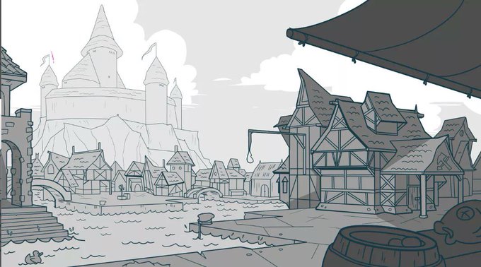
🎨 #BGdesigninsmallbites 🍴 Here’s the latest BG sent to me for feedback— Well drawn overall—perspective treatment is Ok, some playful building shapes—and a cute duck too! One thing that can be improved is giving the layout a more definitive focal point. Here’s what I mean: 1/4
🎨BG Design in Small Bites🍴 This design was sent to me by #xandradoodles I see a lot of stuff like this in portfolios. It’s a solid drawing and a serviceable background. It can also be made more interesting by adding variety to shapes and their spacing:
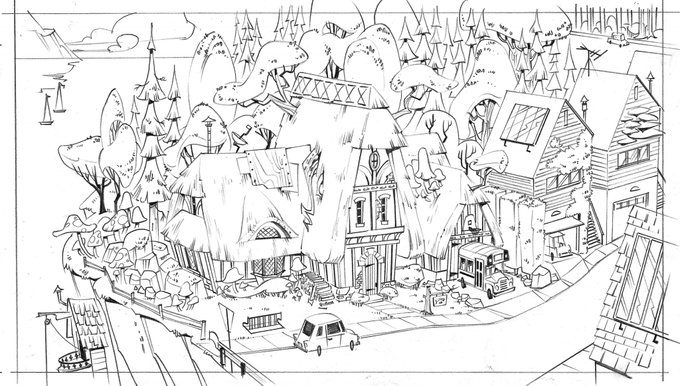
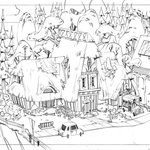
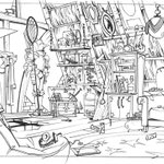
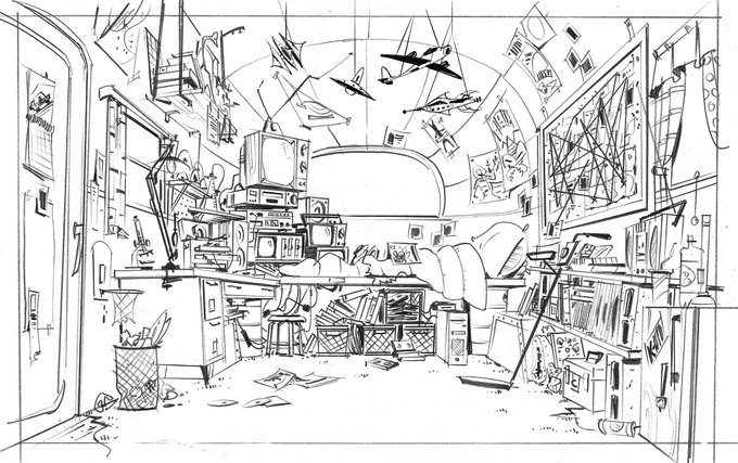
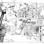
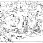
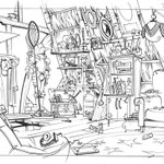
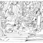
#kidcosmic development sketches- These were done early on before we had a final style for BG design.
正しいカテゴリを運営へ報告する
このツイートに主として含まれるのは、【***】ではなく、以下の画像です。
- 一般向けのイラストおよびマンガ。造形物に描かれた平面のイラスト等もここに含みます。
- コスチューム・プレイ(仮装)をした人物の写真。衣装のみの写真も含む。
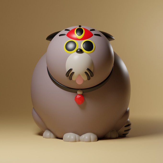
- 立体造形物全般。模型・フィギュア・プラモデル・ドール・ぬいぐるみ・キャラ弁・ハンドクラフト等
- 【イラスト・マンガ】のうち、センシティブな内容(アダルト表現・グロテスク表現)を含むもの。
- 風景写真・ゲームやTVのキャプチャ・スクリーンショット・文字のみの画像等、上記にあてはまらないもの。

This site is protected by reCAPTCHA and the GooglePrivacy Policy and Terms of Service apply.
正しいカテゴリを運営へ報告する
報告ありがとうございました!
内容を確認のうえ、対応いたします。


